
Harmonious Contrasts: Decorating with Red and Blue
Chiqui Woolworth, Annie Schlechter photo for Veranda
~ Harmonious Contrasts ~
Decorating with Red and Blue
In the realm of interior design, color choices hold the transformative power to create captivating spaces. Red and blue, two hues that stand on opposite ends of the spectrum, possess distinctive qualities that can shape the ambiance of a room. When utilized thoughtfully, these strong hues can create energetic interiors that capture the essence of sophistication. In this edition, we explore what these colors mean emotionally and how they behave visually. Then, in celebration of July 4th , we’ll share three ways to decorate with red and blue together, uncovering the harmonious contrasts they create and the dynamic energy they bring to our living spaces.
Emotional Energy:
Red, with its fiery temperament, demands attention and ignites a sense of energy, passion, and excitement. Blue, on the other hand, emanates a tranquil and soothing aura, promoting calmness and stability.
Visual Effects:
Red possesses an alluring quality that draws objects closer, creating an intimate and cozy ambiance. When used strategically, red can be employed as an accent color to inject warmth and visual interest into a space. Meanwhile, blue has the remarkable ability to expand visual horizons, making even modest rooms appear more open and airy. By incorporating blue as the dominant color, a sense of tranquility and cool elegance pervades the environment.
The dynamic pairing of red and blue can create a captivating narrative within your interior, combining the intensity of red with the calmness of blue to form a balanced and visually engaging story. However, the challenge lies in using these powerful colors together without… looking like a flag. We’re revealing three tricks to masterfully incorporate red and blue into your space while maintaining a harmonious and sophisticated atmosphere. Explore the art of embracing boldness, venturing into tertiary colors, or building around creamy neutrals to create a captivating design.
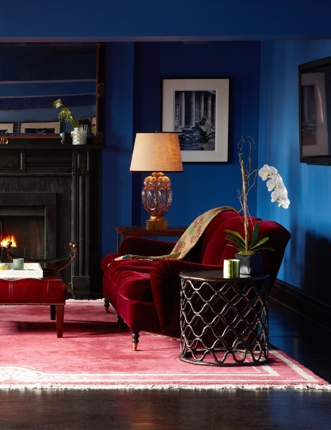
Gramercy Park Hotel Penthouse Suite
Cameron Ruppert Interiors
Embrace boldness in your red and blue interior:
Daring design often involves fearlessly exploring ideas and pushing boundaries. To successfully “go for it” with red and blue, use shades that share similar tonal ranges. Opt for equally saturated and strong hues or equally dark tones. This approach ensures a balance between the two colors, creating a harmonious and striking color palette that avoids overpowering one shade with the other. Embrace the boldness and let the vibrant red and blue take center stage, commanding attention and infusing your space with energy.
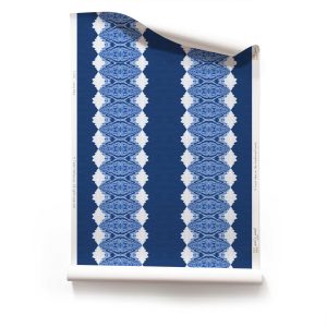
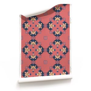
Pearl & Maude wallpaper patterns for going bold: 
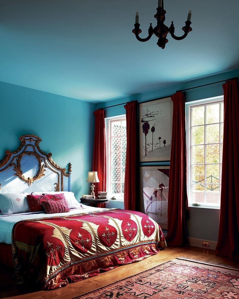
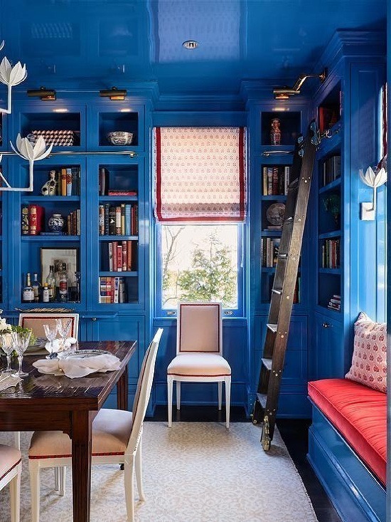
Olatz Schnabel’s Bedroom, New York Times
Cynthia Ferguson Designs
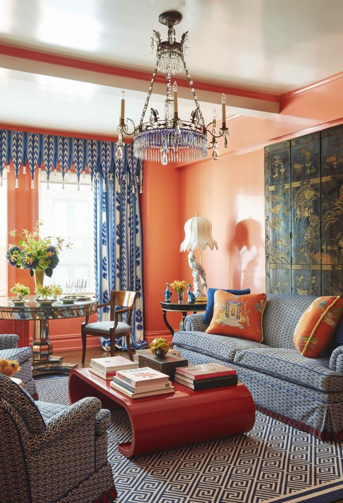
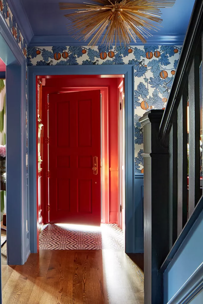
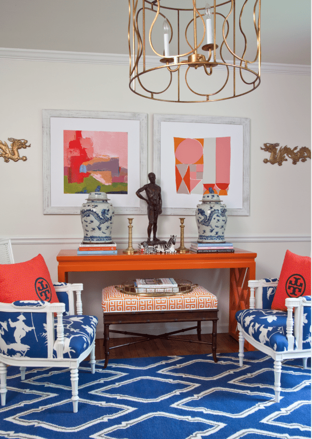
Venture into tertiary colors when decorating with red and blue:
One of the most effective ways to bring red and blue together is by incorporating tertiary colors. Tertiary colors offer a sturdy foundation for your stronger red and blue tones, creating a visually captivating and nuanced environment. Enrich your blue with green, or add orange to your red. Introducing tertiary colors requires color expertise and experimentation with abundant paint swatches. However, the effort pays off, as these additional shades bring sparkle, complexity, and personality to your well-designed space.
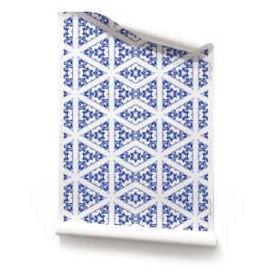
Pearl & Maude wallpaper patterns for going nuanced: 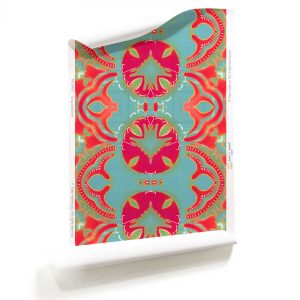
Robert Kime, Ltd. Photo: Conde Nast
Parker Kennedy Living
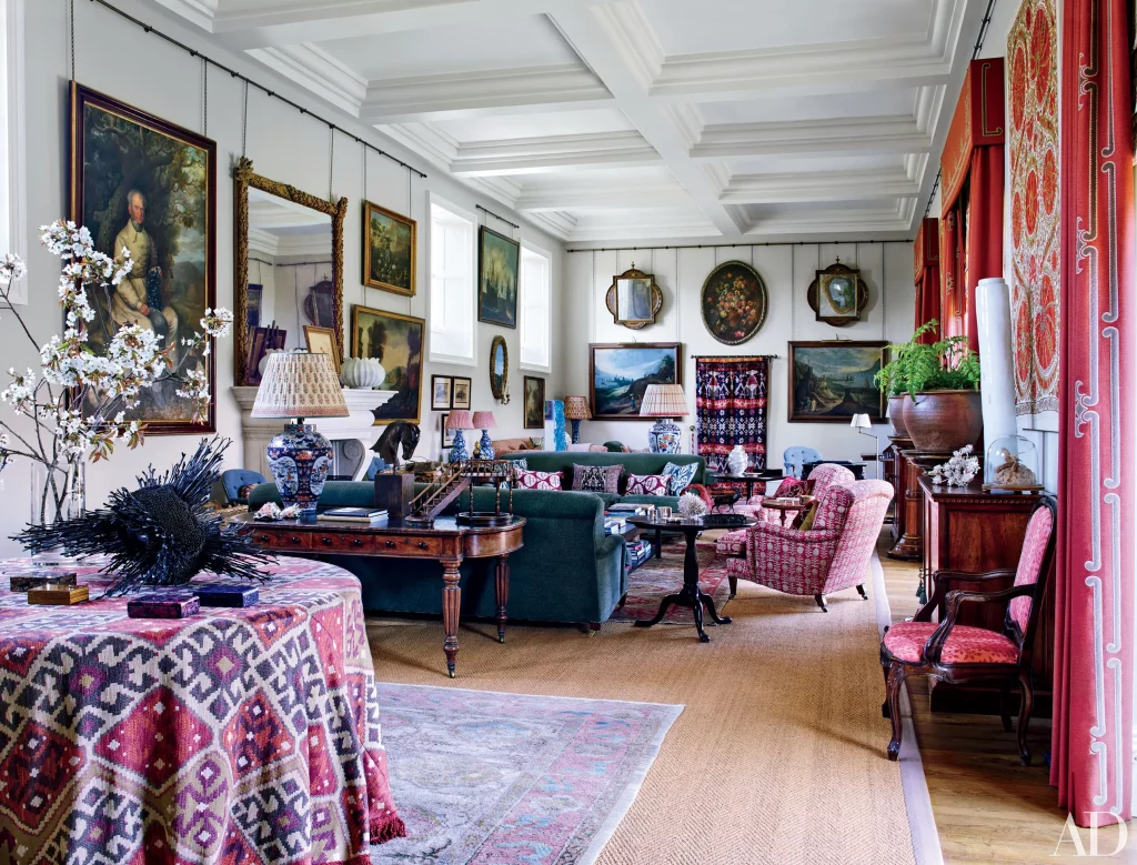
Build your red and blue interior around creamy neutrals:
Creating a red and blue room becomes easier when you have creamy white walls as a backdrop and a budget for accessories. To achieve this look, allow your reds and blues to become the textures in the room. Layer patterns in an array of red and blue hues, anchoring them with brass, gold, and wooden furniture. This approach gives the space a collected, classic, and lived-in feel, while the light walls maintain an open and fresh ambiance. Consider incorporating upholstery, cushions, artwork, rugs, tablecloths, drapes, ceramics, and books to add depth and character. Start with essential elements such as walls, art, rugs, furniture, and drapes, gradually layering in your collection as you discover pieces that resonate with you.
Pearl & Maude wallpaper patterns for layering over white: 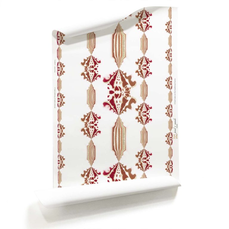
Mastering the art of using red and blue together requires a thoughtful approach that balances the intensity of these colors while maintaining a harmonious and sophisticated aesthetic. Whether you choose to embrace boldness, venture into tertiary colors, or build around creamy neutrals, each approach offers unique possibilities to create captivating interiors. By incorporating these tricks, you can achieve a space that tells a captivating story, showcasing the dynamic interplay of red and blue while exuding elegance and style.
Of course, we wouldn’t leave you hanging without suggesting some of our favorite Pearl & Maude patterns in red and blue…
How do you feel about red and blue interiors? Do you already have one? Drop me a line to tell me about it.
Cheers and Happy Independence Day!
No Comments